 EN

The Box Is the First Thing a Customer Actually Touches
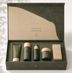
Walk through any beauty aisle and watch how people shop. They pick up a box, turn it over, feel the surface, check the weight, and sometimes give it a light squeeze. All of that happens before the product inside is ever opened. A skincare box is doing a job that goes far beyond holding a jar. It is the first physical interaction a customer has with the brand, and it sets an expectation that the contents then have to meet or beat. A flimsy box with a cheap print job tells the shopper that corners were cut somewhere. A solid box with crisp typography and a satisfying feel tells a different story, and that story gets told in seconds, often without a single word being read.
Structural Choices That Signal Quality Before Reading
The way a skincare box is built sends signals that the conscious mind may not process but the hands definitely do. A rigid box with a magnetic closure feels substantial and premium. A folding carton with a well tuned crease and clean score lines feels precise. A corrugated mailer built for ecommerce has to balance protection with a satisfying unboxing moment. The structural decisions matter because they determine how the box behaves in the customer's hands.
-
Board thickness and caliper affect rigidity and perceived value.
-
Closure type, magnetic, tuck, or sleeve, changes the opening ritual.
-
Interior fitments hold the product securely and prevent rattling.
-
Surface finish, matte, gloss, or soft touch, changes tactile feel immediately.
A packaging designer once described a client who insisted on a lighter board to save cost. The first production run shipped, and returns spiked, not because the product was damaged but because customers described the packaging as cheap in reviews. The cost saving was erased by the reputational hit. That is the tradeoff in plain terms.
Print, Finish, and the Details Buyers Notice Subconsciously
Print quality is where a lot of brands get exposed. Slight color drift between the box and the label, a blurred logo, or inconsistent foil registration all read as carelessness. Color consistency across a production run is measurable, and it is worth specifying. A common industry reference point is to hold color variance to a Delta E of 1.5 or lower, which is generally considered the threshold where the human eye struggles to detect a difference. Finish choices also carry meaning. Soft touch laminates feel luxurious but can show fingerprints. High gloss pops on shelf but reflects light in ways that can obscure text. Matte finishes photograph well for ecommerce and resist smudging. The right choice depends on where the box will be seen, on a retail shelf under store lighting, in a customer's hand, or in a phone photo on a marketplace listing.
A Comparison of Common Skincare Box Formats
Different formats suit different products and channels. The table below compares common options across the parameters that matter most for a skincare brand.
| Box Format | Perceived Quality | Protection Level | Unit Cost Range | Best Suited For |
|---|---|---|---|---|
| Folding carton, standard | Moderate | Moderate | Low | Mass retail, refills |
| Rigid box with magnetic closure | High | High | Medium to high | Gift sets, premium lines |
| Rigid box with sleeve | High | High | Medium to high | Limited editions |
| Corrugated mailer | Moderate | High | Low to medium | Direct to consumer shipping |
| Drawer style rigid box | Very high | High | High | Luxury skincare, holiday |
These ranges vary with board grade, print method, and order volume. The point is not that one format is best. It is that the format should match the price point and the channel, and mismatches are visible to the customer even when they cannot articulate why.
Sustainability Expectations Are Now Part of Quality
A skincare box that looks premium but uses unrecyclable mixed materials is increasingly a liability. Customers, especially younger ones, read disposal instructions and notice when a box is over engineered. The shift toward FSC certified paperboard, soy based inks, and water based coatings is not just marketing. It is a response to real regulatory pressure in markets like the EU, where packaging waste rules have tightened significantly. A box that can be recycled easily, with clear labeling, signals that the brand thinks past the moment of purchase. That said, sustainable materials come with tradeoffs. Recycled boards can have slight color variation, and water based coatings may not match the gloss level of their solvent based counterparts. Being honest about those tradeoffs with the customer, rather than hiding them, builds more trust than a perfect looking box that conceals its environmental cost.
Where an Integrated Packaging Partner Makes the Difference
A skincare box never exists alone. It has to match the bottle, the label, and the carton that ships it, and all of those pieces need to arrive together with consistent color and quality. Coordinating that across multiple vendors is where timelines slip and color drift creeps in. Qiyue Industrial has spent over a decade providing high end packaging solutions for the cosmetics industry, working from a modern standard factory with an integrated system covering R and D, design, production, and sales. Plastic bottles, cartons, and labels all move through the same quality controls, which keeps the whole set aligned. For a brand that wants the box to tell the right story before the product is opened, that kind of integration is what makes the story consistent from the first glance to the last detail.
Table of Contents
- The Box Is the First Thing a Customer Actually Touches
- Structural Choices That Signal Quality Before Reading
- Print, Finish, and the Details Buyers Notice Subconsciously
- A Comparison of Common Skincare Box Formats
- Sustainability Expectations Are Now Part of Quality
- Where an Integrated Packaging Partner Makes the Difference