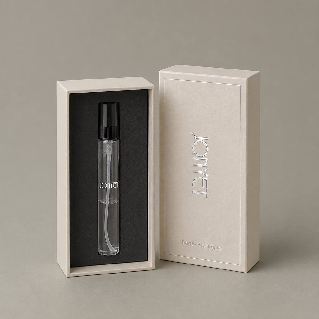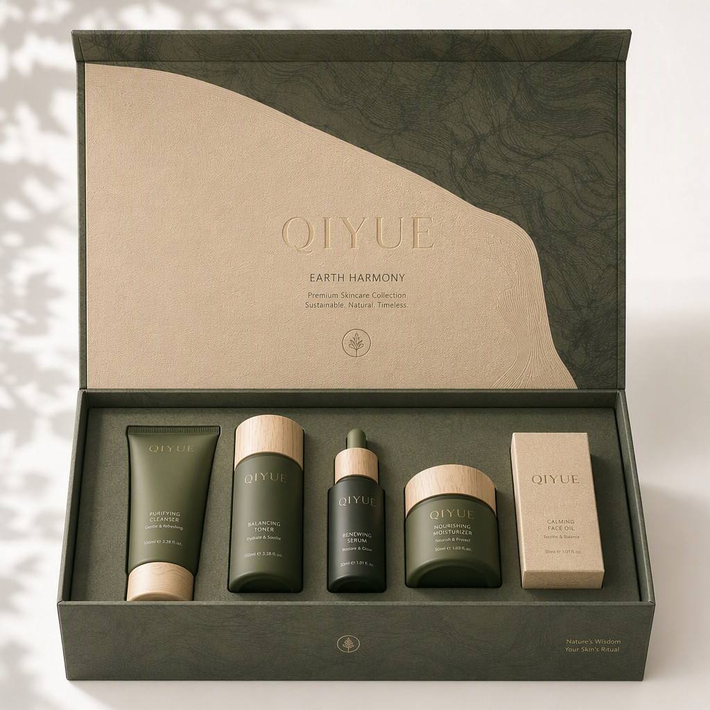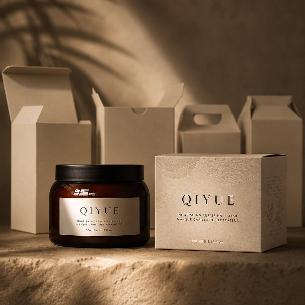
📦 Cascade Series: Art Paper Sleeve Box with Slide-Out Inner Tray
🌟 Product Highlights
• 📦 Signature Sleeve-and-Tray Structure: The box features a two-part construction — a rigid inner tray that holds the product securely, and a wraparound outer sleeve that slides over it. The unboxing ritual is deliberate and layered: pull the sleeve to reveal the tray, lift the product from its nest. This is not a box you tear open — it is one you open with intention.
• 🎨 Art Paper — Tactile Luxury from First Touch: Constructed from premium art paper with a soft matte finish and visible fiber texture. Unlike standard coated cardstock that feels slick and synthetic, art paper has a warm, organic hand-feel — it communicates craftsmanship and sustainability before the customer even sees the product inside. The paper's natural absorbency also makes it the ideal substrate for rich, saturated gradient printing and deep embossed textures.
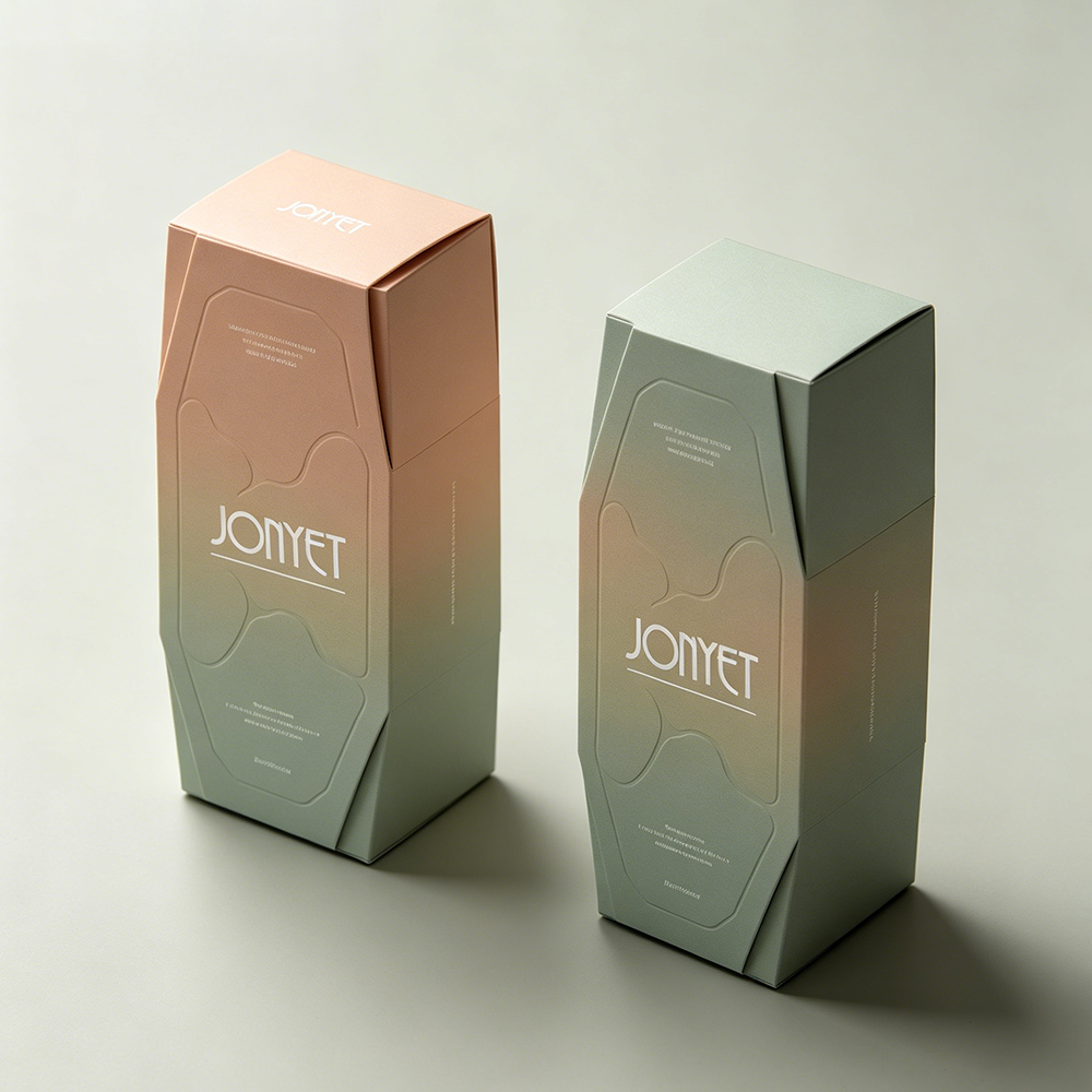
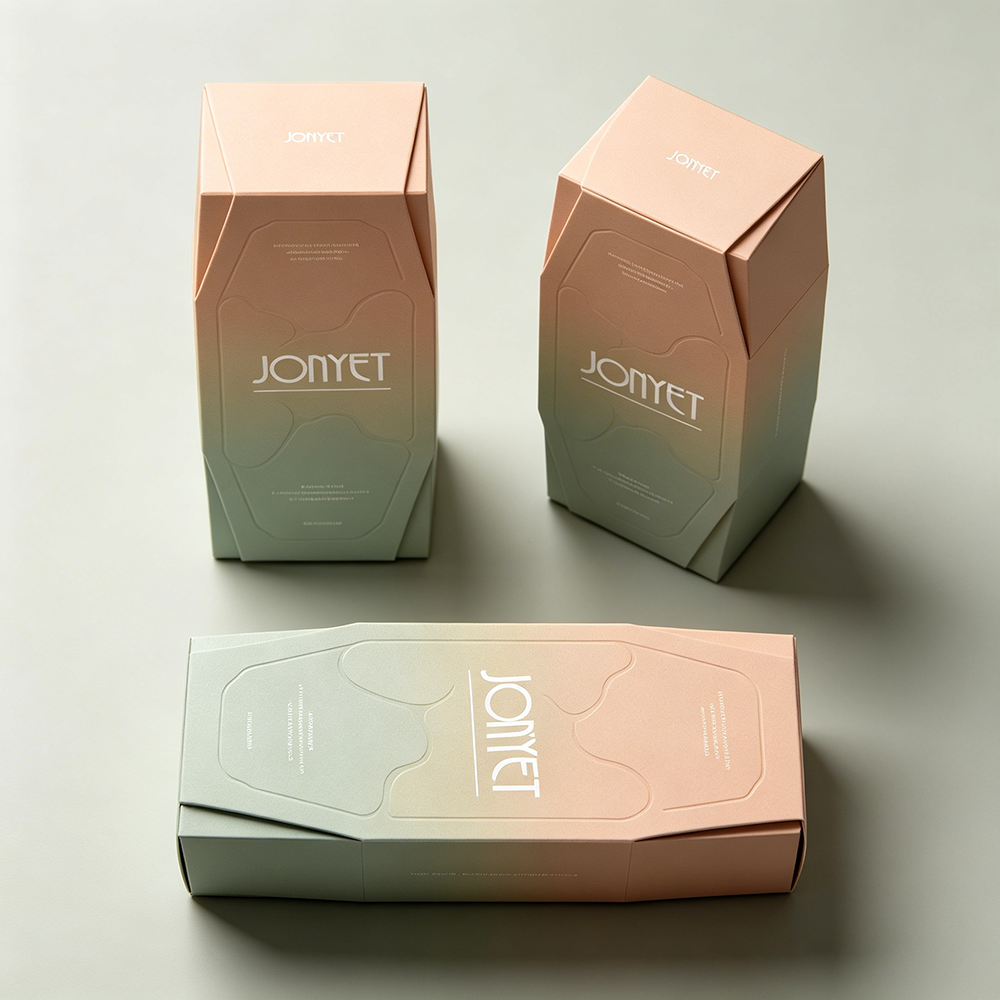
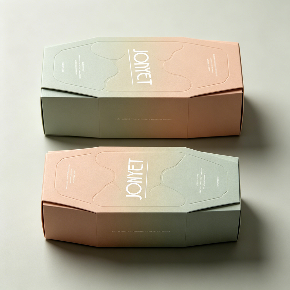
• 🌅 Gradient Color Architecture: The stock design features a luminous horizontal ombre — muted sage green on one side transitioning seamlessly to warm peach/nude on the other. The gradient is printed at full saturation directly onto the art paper, creating a painterly, watercolor-like depth that flat single-tone boxes cannot achieve. The color shift makes the box dynamic — it looks different from every angle, from every distance, under every light source.
• 🏗️ Faceted Geometric Panel Design: The front panel is not a flat rectangle — it features precision-angled chamfered corners that create an elongated hexagonal silhouette. The slanted top flaps and side edges give the box an architectural, sculptural presence. This is packaging as a design object — the kind of box customers keep on their vanity long after the product inside is finished.
• 🌊 Embossed Organic Wave Texture: Across the front and top panels, subtle debossed lines form organic, fluid ripple patterns — like water, like silk, like wind on sand. These are not printed graphics; they are physically pressed into the paper surface, creating a three-dimensional texture that shifts with the light and invites touch. The embossing is calibrated to the gradient — the depth, spacing, and curve radius vary across the panel surface, creating a living, breathing texture rather than a mechanical repeat pattern.
• 📏 Pinpoint Sleeve Fit Tolerance: The outer sleeve is precision die-cut to slide over the inner tray with exactly the right friction — snug enough to stay closed during shipping, smooth enough to open with one hand. No loose sleeves that fall off in transit. No tight sleeves that require wrestling to remove. The fit is engineered, not guessed.
🎨 Appearance & Aesthetic Design: The Power of the Slide Reveal
The Cascade Series is designed for brands that understand packaging is the first physical touchpoint with the customer — and the most photographable moment in the product's lifecycle.
• The Sleeve Unboxing Ritual: Standard boxes open from the top — you lift a lid, and the product is there. The sleeve box inverts that expectation. The customer slides the sleeve horizontally, revealing the inner tray inch by inch. The product emerges gradually, like a curtain drawing back on a stage. This slowed-down reveal makes the unboxing more cinematic, more memorable, and infinitely more shareable on social media.
• The Gradient as Brand Canvas: The peach-to-sage ombre is not just decoration — it is a brand narrative device. The warm peach side can carry your logo and product name; the cool sage side can carry ingredient stories and usage instructions. The gradient visually separates information zones without needing lines or boxes. It is a design system, not just a color effect.
• The Embossed Topography: Most embossed packaging patterns are repetitive — the same motif tiled endlessly. The Cascade Series uses a non-repeating organic pattern that flows across the panel like water. Each ripple is unique. The effect is closer to natural stone, handmade paper, or textile than to industrial packaging. This is the detail that makes customers run their fingers across the box before they even look at the brand name.
🛠️ Technical Specifications
Precision-engineered for flawless sleeve-to-tray integration.
Specification | Details
Box Style | Sleeve Box (Outer Sleeve + Inner Slide-Out Tray)
Material | Premium Art Paper — Matte Finish with Fiber Texture
Paper Weight | 1200gsm Rigid Board Core + Art Paper Wrap
Structure | Outer Wraparound Sleeve + Inner Product Tray
Front Panel | Faceted Geometric with Chamfered Angular Corners
Surface Finish | Full-Color Gradient Print + Embossed/Debossed Organic Patterns
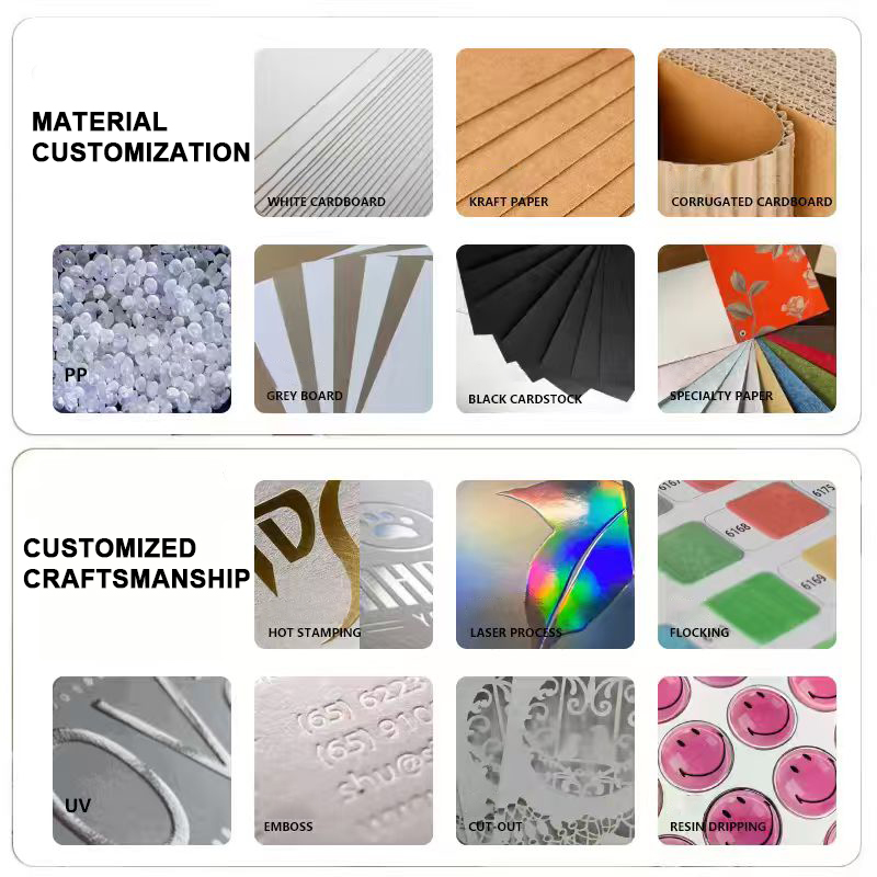
Logo Craft | Foil Stamping (White/Gold/Silver) / Debossing / UV Spot / Silk Screen
Inner Tray | Custom Die-Cut Insert — Fits Specific Bottle or Jar Profiles
Color Options | Custom Pantone Gradient (Any Two-Color Combination)
Size Options | Fully Custom — Scaled to Product Dimensions
MOQ | 1,000 pcs
Certification | ISO9001 / Sustainable Paper Sourcing Available
• Note: The sleeve-and-tray fit tolerance is the most critical QC metric. We test every production batch with a slide-force gauge — the sleeve must slide off with 200–400 grams of pull force. Too loose and the sleeve falls off during transit; too tight and the customer damages the box trying to open it. This tolerance is maintained across every unit in every batch.
🌈 Full Customization & OEM/ODM Services
Transform this art paper sleeve box into a proprietary brand asset with our end-to-end customization capabilities.
• Custom Gradient Design: Any two-color combination — sage green to cream, dusty rose to sand, midnight blue to silver grey, terracotta to blush. The gradient direction, saturation, and transition curve are all customizable. For brands with a three-color palette, we can create a tri-tone gradient across the sleeve and tray panels.
• Art Paper Selection: Choose from a curated library of art paper stocks — linen-textured, felt-finish, recycled kraft, metallic-fleck, handmade-look, or smooth matte. Each paper stock changes the box's personality: linen reads as heritage and natural; metallic-fleck reads as contemporary and festive; recycled kraft reads as eco-conscious and honest.
• Custom Embossing & Debossing Patterns: Replace the stock organic wave pattern with your brand's signature motif — geometric lattice, botanical leaves, abstract topography, monogram repeats, or custom artwork. Our embossing tooling captures detail down to 0.3mm line width. Combine embossing (raised) and debossing (recessed) on the same panel for multi-depth texture.
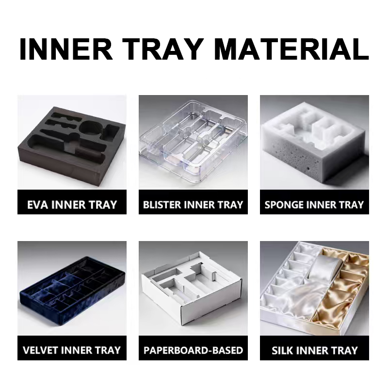
• Inner Tray Customization: The inner tray can be designed to fit any bottle or jar profile — cylindrical, square, tapered, or custom shapes. Single-product trays, double-product trays, and multi-product gift set trays are all supported. The tray can be wrapped in the same art paper as the sleeve, or finished in a contrasting color or texture.
• Foil & Print Customization: White foil stamping (shown), gold, silver, rose gold, holographic, or matte metallic foil. Combine foil with debossing for a recessed metallic logo — a premium detail that catches light differently from flat foil. Silk screen printing, UV spot varnish, and full-wrap digital printing are also available.
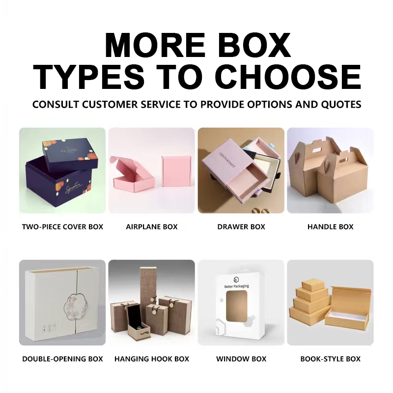
• Structural Customization: Modify the box geometry — taller, wider, deeper, different chamfer angles, custom flap shapes. The sleeve-and-tray architecture can be adapted to any product dimension while maintaining the signature faceted front panel and slide-open ritual.
• MOQ: 1,000 pcs (stock art paper, standard gradient, standard embossing pattern). Higher quantities may apply for custom paper stocks, custom embossing tooling, or multi-tone gradients.
🧴 Core Applications: Where the Art Paper Sleeve Box Excels
The sleeve-and-tray architecture, embossed gradient design, and premium art paper tactile experience make this box the strategic packaging choice for:
• Serum & Treatment Concentrate Bottles: The most common use case. High-value serums, ampoules, and treatment concentrates that command premium pricing and deserve premium packaging. The sleeve box adds perceived value — the customer feels they are buying a ritual, not just a bottle. The inner tray can be die-cut to fit dropper bottles, pump bottles, or rollerball applicators with millimetre precision.
• Face Cream & Eye Cream Jars: Wide, squat jars of rich moisturizers and eye treatments. The sleeve box provides the structural protection these heavier glass jars need during transit while adding the unboxing drama that justifies their price point. The inner tray cradles the jar so it presents perfectly centered when the sleeve is removed.
• Fragrance & Perfume Bottles: The sleeve-and-tray format is the fragrance industry standard for a reason — it protects delicate glass bottles during shipping and creates a theatrical reveal that matches the emotional experience of a fine fragrance purchase. The embossed gradient design echoes the notes of a fragrance pyramid: top notes (light, the peach side), base notes (deep, the sage side).
• Gift Sets & Discovery Kits: Multi-product gift sets with 2–4 items. The inner tray can be divided into individual compartments for each product, and the sleeve wraps the entire set in a unified visual statement. The sleeve box transforms a collection of separate products into a singular curated experience.
• Brand Launch & Limited Edition Packaging: The 1,000 pcs MOQ makes this box accessible for limited-edition launches, seasonal collections, and brand debut campaigns. Create a special gradient and embossing pattern that exists only for this release — the packaging becomes a collectible in its own right.
• Premium Subscription Box & Advent Calendar Packaging: The slide-out format is ideal for subscription box hero products and advent calendar drawers. The sleeve protects the contents during fulfillment while providing a premium reveal experience that subscribers look forward to every month.
💎 Why Choose QIYUE as Your Art Paper Box Supplier?
• Sleeve Fit Guaranteed: The slide-fit tolerance is the difference between a premium experience and a returned product. We test pull-force on random samples from every production batch. Every sleeve in your order will slide off smoothly with consistent resistance — no exceptions, no excuses, no "it was fine when it left the factory."
• Gradient Color Consistency Across Print Runs: Gradient printing on art paper is technically demanding — the transition zone can shift, band, or ghost if press calibration drifts. We document every custom gradient with spectrophotometer readings at 5 anchor points along the gradient path. When you reorder 6 months later, the ombre will be identical to your first production run.
• Embossing Depth Uniformity: Deep embossing stretches paper fibers — inconsistent pressure creates inconsistent depth, which creates inconsistent visual impact. We QC embossing depth on every batch with a digital depth gauge. The pattern on your 1,000th box will have the same tactile presence as the pattern on your first.
• 10+ Years of Cosmetic Packaging Expertise: Backed by 1,000+ mature mould sets and ISO9001 quality management, QIYUE has delivered integrated packaging solutions for over 10,000 global beauty brands.
 EN
EN